Saturday, April 19, 2014

MON VILLANUEVA'S FISH FIXATION

By Arnel Mirasol

Mon Villanueva at work
Don't be fooled by the beer bottle Mon Villanueva is holding. Mon is no bohemian. He is a devoted family man who considers his wife and daughter his treasures. Well, he may drink from time to time as most males do, but drinking is not the be all of his existence. For all we know, that Red Horse Beer bottle Mon is holding may not contain beer at all - but linseed oil or turpentine. Seriously now: Mon Villanueva also amazed me. Like Jojo Garcia, he is another fine arts classmate whom I pointedly ignored during our college days at the University of the East (UE). That's because he looked to me like another happy go lucky guy who's head was not in his studies.
Blue Period


Fishes of Eight
Anyhow (Grilled)
So, you can just imagine my surprise when news reached me that he won first prize in the 1994 Metrobank Young Painters Annual. My surprise, I must confess, was tinged with envy, because his prize money was fifty thousand pesos, while the prize I won in the first edition of that contest in 1984 was only ten thousand. I was further disappointed because he forgot to treat us, his old classmates, to even a few bottles of beer. Unlike me, who spent a whole day on gimmicks with Bert Falsis and Rolly Cruz - the guys who accompanied me to the bank when I had my cheque encashed. Mon's winning entry to the Metrobank competition, Nang Mahimbing si Mariang Makiling, Nanalanta ang mga Sakim is in oil. It depicts a crowd, a group of small-time loggers perhaps, who are ravaging a forest of leafless trees. It was a disturbing yet charming work - done when he was already a student at the Philippine Women's University, where he transferred when he left UE. Painted with much skill, and a rather obsessive attention to detail - that winning painting showed that the intervening years weren't wasted; that Mon, had perhaps, chucked off his non-conformist ways and had trodden instead the straight path towards the thorough honing of his craft.

He again surprised me several years later when he became a finalist in one Philip Morris painting competition, where his entry was done entirely in carved bamboo colored with oil paint. I wasn't much impressed with that work because it looked, with its garish colors, handicraft-y to me. But my rather low regard for his bamboo relief pieces was then. Now, Mon had already hurdled the barrier separating mere craft from fine art, and his recent pieces, all intricately done and in harmonious colors yet, look so pleasing to my eyes. Today, what I envy Mon for was his originality. I don't remember any fine artists who once used bamboos as medium. Mon's pieces are uniquely his own, while mine suffers from being an amalgam of my various influences. Mon is original, I am not.

We can see from samples of Mon's art above that he is very much fascinated by the fish motif. He was not the first one. Many painters before him have depicted fishes in their paintings, though not obsessively so - like Picasso, Magritte, and our very own Ang Kiukok and E.R. Tagle - and even me, for that matter (below right). But we were all sissies compared to Mon, because our paintings were accomplished by near-effortless flicks of the wrist and of the hand holding the brushes: while Mon's bamboo reliefs require brawn and finely-honed woodworking skills.

The Ichtus
Pablo Picasso at work
A painting by Rene Magritte


A painting by Ang Kiukok


A painting by E.R. Tagle
I

I can only surmise why Mon is obsessed with fishes. The fish - the ichtus (above left) - you see, was a symbol used by early Christians to identify themselves, That fact may make me conclude that Mon is probably a very devout Christian nowadays. Or, Mon perhaps might be a secret adherent of E.R. Tagle's Positivism dogma that posited fish to be a positivist or prosperity symbol. This conclusion is nearer to the truth, I must say, if we consider the painting Fishes of Eight, because the number 8 as we all know is considered a lucky number by the Chinese - and luck in all cultures is almost always tied up with material abundance and prosperity. But whatever his reasons are, all that Mon has to do if he wants luck to saunter after him like a frisky pet dog is to continue turning out masterly bamboo reliefs like he had been doing for several years now. And he need not limit himself to doing rehashes of fish compositions, ad nauseam, because any other image if painted - or in his case, carved- with great care and skill can only invite luck and praises from his admirers, which now include me.

Mon Villanueva and Zero

Wednesday, April 9, 2014

RIC ARTE'S SEARCH

By Arnel Mirasol


One need not take up Fine Arts in college if one wants to be a good painter. There are a few or even several painters, whose names escape me at present, who are big names now in the Philippine art scene even though they weren't fine arts students before. There was the National Artist Hernando R. Ocampo, who was a writer by profession, but went on to make his mark as an abstractionist with a very distinct style. There was also the architect Onib Olmedo and the pilot Lino Severino. Even though Olmedo and Severino are not, and may never be, National Artists, still, I count them among the most illustrious names in Philippine art history. Why? Because both of them have inspired and influenced many painters, who emulate their style and choice of subject matter. Many painters, including Marcel Antonio, who's National Artist material himself, have openly admired Olmedo's works. I can also add Elmer Borlongan (another National Artist material in my book), and perhaps his whole Salingpusa confreres, among Onib's admirers. Looking at Onib's painting (below), we can easily see who Elmer's source of inspiration might be for the bald humanity he is fond of depicting in his paintings.


Lino Severino, on the other hand, seems to be forgotten nowadays, because I haven't yet heard of any painter of vintage houses paying tribute to him as his primary influence. A pity - because Severino was a big name in the seventies. He was the one who popularized paintings of old houses, facades mostly, which he depicted in a manner that was almost abstract. I consider these paintings - his Vanishing Scene Series (below) - as still the best of this genre.


Ricarte Ico follows in their footsteps.Although his talent in art seems innate (his fascination with drawing began from his pre-school years), it wasn't Fine Arts that he took up in college. He majored in History at the CAP College Foundation, and also earned later on a Certificate in Teaching at the Don Mariano Marcos Memorial State Univerity. He also has several units in architecture from Saint Louis College La Union tucked under his belt. Ricarte was born and raised in San Marcelino, Zambales, but is now based in Bauang, La Union. Ricarte learned the basics of painting from artists friends, and honed his skill further through self-study and constant practice. His knowledge in architectural drafting led Ricarte to explore the possibilities of integrating fine art and architecture in his paintings. Ricarte had already won four first prizes and one second prize in six on-the-spot competitions he joined. He had exhibited works in various venues in San Fernando City, La Union, and Metro Manila. I met Ricarte at facebook, and I've encountered him in person only once, at the Marikina Riverbanks, when we were both invited by Isagani Fuentes to join his group, Akwarelistas, in their plein-air painting session. A sociable fellow apparently, Ricarte, although residing in far-away La Union, readily confirmed his attendance, and was at the painting venue early. Ricarte is a member of several art groups, like the Artists Guild of La Union, and also of the Pinoy na Pinoy Visual Artists, Inc.(PPVAI), and the Art Association of the Philippines (AAP) - which further attests to his outgoing ways. Ricarte is not a full-time painter yet - he is still working as an Administrative Assistant at the Department of Education's office in San Fernando, La Union.


Ricarte started painting in 1995. He began as a realist, as all painters should. I have reiterated in my writings that an artist should first master the rudiments of realist drawing and painting before venturing out to try his hand in abstraction and other modernist styles. And that was exactly what Ricarte did. Among his early works, his painting of sunflowers (above right), is the one I like best. Although pointillist at first glance, this painting's brushwork is really distinct from the original pointillist technique invented by Georges Seurat, and popularized here by Ibarra dela Rosa. Seurat's method was to juxtapose dots of different colors which were blended optically by the viewers' eyes to create from afar the illusory intermediate colors. Ibarra utilized the same principle, but his brushwork deviated somewhat from Seurat - instead of dots, he applied sausage-like curvilinear shapes to his canvases. Ricarte does things differently, however. He applied his dots of lighter hues more as finishing touches, to lighten areas in his paintings that need lightening. Whether true or not to the pointillist principle , Ricarte's paintings can be as charming as the paintings by the old masters of pointillism like Seurat, Pissarro, Signac, Sisley, and Ibarra. But Ricarte is not only a sociable fellow; he is also apparently a restless one. He could have rested on his pointillist laurels and content himself in churning out pointillist canvases for the rest of his painting career - like what Ibarra did. But, no - he chose to explore other styles, specifically cubism. His paintings in this genre are on the verge of becoming non-objective abstractions, especially the later ones of fishes , whose lines, both the straights and the curves , seem to be drawn using rulers and other mechanical drawing instruments. Perhaps, this is the fusion of fine art and architecture in his paintings that Ricarte spoke of. I wouldn't be surprised if Ricarte veered further towards the non-objective extreme of Constructivism and Suprematism, because Ricarte after all was an architectural draftsman once. He would I'm sure relish drawing the lines, squares, and arcs that define the paintings of the practitioners of those schools. At any rate, this search for new forms on the part of Ricarte should be applauded. The results justify his experimentation. Because his cubist paintings of fishes (and even of the playful Angry Birds below) will most likely win the nod of those critics, collectors, and painters, who consider the clinically-realistic academic paintings passe, trite , and uncreative.

Angry Birds of Paradise

Thursday, April 3, 2014

JOPUNK ROCKS, JOPUNK ROLLS


By Arnel Mirasol


Jojo Garcia's love affair with jeepneys continues. Jeepneys as subject matter in painting have already been done to death, so to speak, by many Filipino painters in the past. Vicente Manansala, Antonio Austria, and Rock Drilon, to name only the most prominent, have dabbled with the jeepney motif at one time or another. There was also Junjie Versoza, Jojo's close friend in college, who made the repeating frontal images of jeepneys his signature style then. It was perhaps fascination with Junjie's paintings that prompted Jojo to do his own take on jeepney images. (below left, a painting by Junjie Verzosa)


Anyway, despite not being the pioneer in the field of jeepney painting, Jojo's substantial contribution to jeepney visual lore isn't diminished one bit. His jeepney paintings (samples below right) also fascinates - and amuses. The words and phrases written on the jeepneys' "headboards" (or visors?) and bumpers are very revealing not only of the milieu, but also of the very personality of the artist himself.


From words like Rock n' Roll, Walastik, Wild Street, Betrayed, Oioioi, Dead Ends, Bandits, Sex Pistols, Rakista, and Kankaloo, we can easily deduce that Jojo Garcia was a "punkista" from Caloocan, who have chucked off his old ways and found his true path in art. Jopunk rocks, not through music, but through his paintings. And he's also on a roll these days. Jojo excused himself from joining us on several occasions because he was up to his neck with painting jobs. His jeepney paintings are - pardon the cliche - selling like hotcakes. That's why he no longer has time to bond with us, his old comrades-in-art. But that's a positive development, I suppose; because I'm sure that when he gets to find the time to join us, he won't hesitate to pick up the tab and treat us all to the mother of all drinking binges.


Above photo, taken during my younger son Kai's first birthday celebration in 1988, shows from left, Rolly San Mateo, George Calma, JR Alonzo, and Jopunk Jojo Garcia himself.


Wednesday, April 2, 2014

DEAN OF WATERCOLORISTS

By Arnel Mirasol


In contrast to the guy I wrote about previously - my comrade-in-art Jojo Garcia - Jerry Dean was a very disciplined student. He diligently attended his classes, passed his plates on time, and abhors gallivanting and indulging in forbidden pleasures . He is one classmate whom I have not lost track of over the years. We are compadres - he is ninong (godfather) to my younger son, Kai. We were also partners once in a t-shirt printing business, and snorkeling buddies too.

Jerry worked for many years in animation, first as special effects, and later, as background artist. His stint in this field honed his skill in watercolor techniques. With the advent of the computer, he was compelled to learn Photoshop and other digital painting programs. Jerry had also worked abroad, in Vietnam and Singapore as animation background artist, and in Kuwait as muralist. Although the latter job paid well, he confessed that he'd rather not do murals again if the job includes doing ceiling paintings, which gave him a bad neck.

 His marriage opened for him another career - that of cake decorator. His wife, Franz, you see, owned a bakery, and she encouraged Jerry to enroll in a cake decoration course. Jerry did, and the knowledge he acquired he was able to put into good use when he went to work in Singapore as cake decorator. He was back after almost a years' stay in Singapore and is again indulging his true passion which is watercolor painting.


Rouge at Dawn


Jerry likes his watercolor paintings wet - that is, he loves applying watercolor paints or inks on wet paper, and lately, canvas surfaces. The effect he's aiming for is the one wherein the paint "explodes" or spreads out upon contact with the wet surface. (see above).


Early Journey

Unlike his old watercolors (right), Jerry's 2011 works, Self-Contentment and Fusion of Archetypes (below), are very much pared down, and very colorful too. This is all to the good, because his abstract treatment of part of the background gives the painting a more spontaneous and fluid quality, which are traits one always looks for in watercolors.


Self-Contentment
Fusion of Archetypes


When his love affair with watercolor will end Jerry can't answer as yet. He had implied that he hasn't exhausted all the possibilities of the medium. As things stand he is just into herons, flowers, and boats. So we can expect Jerry to devote several years more to watercolor if he intends to take on the challenge of depicting other subject matter.


Wednesday, March 26, 2014

MY LIFE AS AN ARTIST

By Arnaldo Bernabe Mirasol


I was born and raised in Tondo, Manila. I first took up Fine Arts at the University of Santo Tomas, but quit after my second year. I shifted to architecture, then tried engineering, and finally, in my mid-twenties, I resumed, though failed again to finish, my art studies at the University of the East. I began working as a professional artist in 1981, when I got employed as political cartoonist for the newspaper, People`s Journal Tonight. After my short initial stint as political cartoonist there, I decided to paint full-time after being inspired by a book on Dali. It was the declining years of the Marcos regime and many paintings being done and exhibited at that time were political in content. I rode the trend and painted social realist canvases, but with a surrealist twist. In 1984, my painting Hungry Child Dissected (below left) won the top prize in the First Metrobank Annual Painting Competition.  It was a most prestigious competition then as it is at present.

Hungry Child Dissected


When I got married in 1985, I worked briefly as an art gallery assistant at the Galeria delas Islas. Then in 1987, I returned to political cartooning with the We Forum Publications of Joe Burgos. It was there that my skill in pen and ink drawing was honed. I also learned a lot about political cartooning from Mr. Burgos. He told me that the most witty cartoon is the one that is most visual, meaning, the lesser the text and captions, the better. So, that axiom became my guide in cartooning. I always strive to impart the message sans text and captions. I didn`t always succeed of course, but I`ve created through sheer persistence, several pieces that spoke eloquently of my message without saying it, so to speak. (sample below right)


The Commander-in-Chief

The time came when the paper ceased being a daily. Thus, I took on another job as educational book illustrator to make full use of my time. I started with Phoenix Publishing House, then Rex, Abiva and Bookmark. That was way back in 1988. The highlight of my career in textbook illustration was the series of full-color cover art I did for Phoenix Publishing. It was while doing them that I developed the style that would make a good impression on publishers. When I approached Rex printing and Tahanan Books, two of several houses here currently engaged in picture book publishing, their publishers reacted favorably after leafing through my portfolio. The moment suitable manuscripts came along, I was offered the job of illustrating them. So far, seven picture books which I illustrated were published: First Around the Globe; Tamales Day; The Origin of the Frog; The Brothers Wu and the Good-Luck Eel; Once Upon a Time; Long Ago and Far Away; and The Mermaid's Castle. My eight picture book, Mga Modernong Alamat Volume 4 will be out in the market anytime soon. (below: sample illustration for Alamat ng Palay)


Miss Butterfly


My first exhibit of fairy tale illustrations took place on September 8, 2001, at the Crucible Gallery. Featured in the exhibit were the original illustrations for the book, Once Upon a Time (right). The exhibit opening was very, very soft: no guests-of-honor, no ribbon-cutting, no cocktails. But there were sales. Of the eleven illustrations on show, nine were sold. No mean feat in these persistently lean times. Although I was disappointed that my show was completely ignored by art writers here, the flattering comments of the ordinary gallery-goers lifted my spirit. Among the flurry of praises heaped my way, none flattered me more than someone`s remark that I was perhaps the Philippines` "own Maxfield Parrish".


My second solo show at the Crucible - which opened on March 13, 2007 - featured not only the illustrations for the book, Long Ago and Far Away (left), but also a suite of paintings belonging to my machismo series. (selected samples below) I guess I can adjudge this show more successful than the first, because aside from selling several artworks, the show was also noticed by the art critic Constantino Tejero. His feature on me (see bottom) appeared in the Philippine Daily Inquirer (PDI) on June 25 - a day I expected would be rather dismal, because it was my birthday and I was again impecunious. You can just imagine my surprise and elation upon seeing in the PDI's art news page his review of my show. I was so excited that I immediately rushed out of the house to buy several copies more of the paper.


Happy Man  / Corrupt Bureaucrat Dissected 2
.
Supremacy of Eve

Seraglio Fantas


Before starting work on Once Upon a Time, I considered my illustrations for the books, The Brothers Wu and the Good-Luck Eel and The Origin of the Frog (left) as the apex of my achievement as illustrator. I have reason to because both of these books won recognition abroad; The Origin of the Frog was a runner-up in the 2000 Noma Concours for Picture Book Illustration in Tokyo, while the excellence of my illustrations for the Brothers Wu and the Good-Luck Eel landed me in the 2002 Honour List of the International Board on Books for Young People, based in Basel, Switzerland. But after seeing the illustrations of Gennady Spirin, Wayne Anderson and James Christensen in the books lent to me by my publisher Reni Roxas, my attitude changed. The truth that the quality of my works are still way below the world`s standard became evident to me. And my ego got deflated.


I still live in Tondo with my wife, Carina, and two sons. My sons, Bahgee and Kai both finished business courses and are now gainfully employed. Although they showed flair for art-making when they were kids, I didn`t encouraged them much. Having known firsthand the struggle and deprivation that an artist has to go through in life, I dissuaded them from taking up fine arts. But of course, if they really insisted on pursuing an art career, well, fine, I`ll give them my blessing. Happily, to my relief, they didn`t. They seem more intent on getting rich. An attitude I approve of very much, because perhaps, this father now have reason to expect a comfortable old age courtesy of the two.


Friday, March 21, 2014

The Right of an Artist to Choose His Own Subject Matter

By Arnel Mirasol

Eyes of Love, 2008, acrylic on paper
Not too long ago, I had an online tiff with Kirsten Anderberg, who describes herself as a feminist, historian, human rights activist, writer and musician. When I checked her profile info, I realized that she is also a 1997 graduate of the Whittier Law School. So, she must be a full-pledged lawyer by now. Awesome credentials indeed, anyway you look at it. Our discussion revolved mainly about the paintings I did of nude female models (sample above) featured in the several girlie magazines I kept at home. Kirsten wondered why I was doing only female nudes. She asked me to add male nude paintings to my repertoire, to which I answered that it's a big no-no for me, because naked male bodies disgust me. Apparently, she overlooked , the "hahaha..." I end my answer with to indicate that I'm just being facetious. She assailed my saying that, because she must have thought my disgust real. She quickly presumed that I was homophobic, or a hater of males. ( Kirsten and I were both wrong in our understanding of the word. Homophobia actually means fear or hatred of homosexuals. My apologies.) Well, what else should I say. I'm a true blue straight male who don't exactly relish painting models with dangling, or, God forbid!, tumescent sexual paraphernalia.


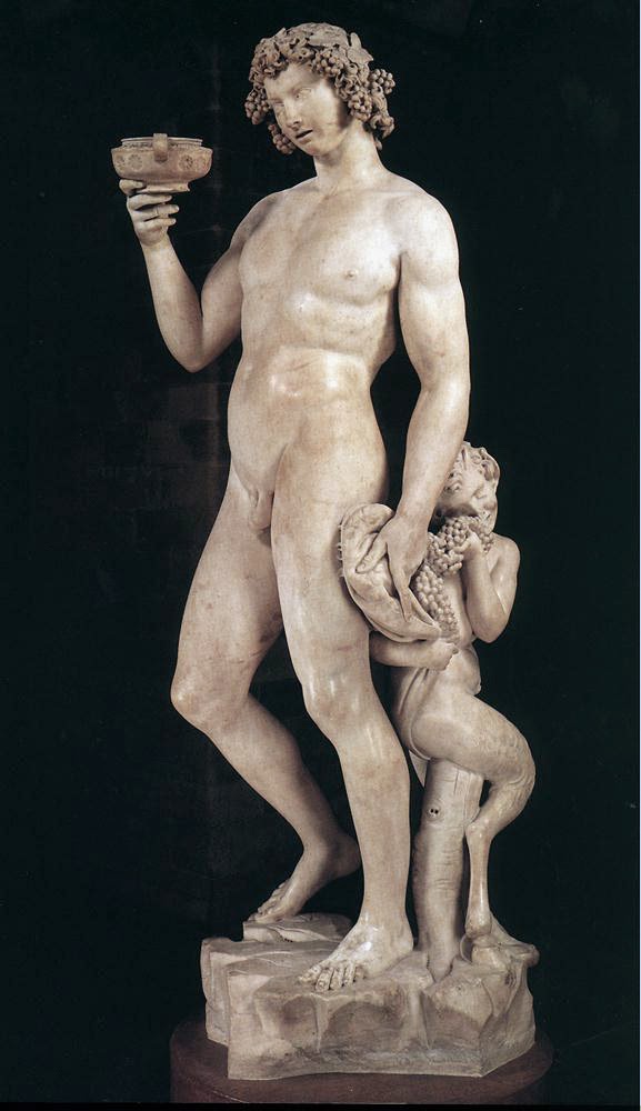
She next told me that she can't quite believed that I see nothing beautiful in Michelangelo's naked male sculptures (left). Well, which artist won't be entranced by them. In fact, when I was still in art school, Michelangelo's paintings of powerful males (below) were the first artworks I tried to emulate. I was so enthralled by him that I bought two books that featured his art.
But Kirsten should understand that when an artist admires male nude artworks, it doesn't follow that that artist will be obliged to also create male nude artworks. Not wanting to paint naked male bodies doesn't imply hating them, or the male specie in general. Kirsten insistence on their being one and the same is stupid logic. My fascination with Michelangelo's paintings of naked males is over, and I'm now pouring my efforts in painting, not only female nudes, but also picture book illustrations and other paintings depicting a variety of subject matter and styles.


Her supposedly observant eye then focused on a female nude painting I did - that of Marilyn Monroe in high heels - Maria Lina Desnuda (left). She remarked that Marilyn shouldn't be so glamorized because she led a sad life. She may have achieved fame and fortune, but she in truth felt exploited. That's why she succumbed to the lure of drugs and was so depressed that she eventually committed suicide. How true and how sad.

But what Kirsten said next, floored me. Here, unedited, are her exact words: " I ask you paint a few of her DEPRESSED, LONELY, DRUNK ALONE DESPERATE let's paint REAL portraits of who she was for once! Paint THOSE pictures, not this trite predictable made up crap of a "fairy tale" of what women never should want to be unless they want to be MISERABLE AND DIE YOUNG."

The nerve! Who does she think she is? She has no right whatsoever to dictate to me what I should paint next. It's none of her business if I want to paint a thousand portraits of a glamorized and orgasmic Marilyn Monroe oozing with sex appeal and joy. Kirsten opinions on my art doesn't count. She may affixed to her name all those highfalutin titles, but still, I won't consider her critique valid and relevant: because I can see at a glance that her knowledge about art is sparse and threadbare.


The only opinions about art I highly esteem and put a high premium on are those of my peers - my fellow artists; those of the art critics, art dealers, art collectors, and most especially those of my family and friends, because I know that they always mean well even if they negatively criticized my artworks. If she wanted more male nudes painted, then I, a male painter, shouldn't be the one she should pester. She should ask the female and gay painters she knows to do it for her. Maybe, she should also request the best painter nowadays of pin-up style female nudes (below), Olivia de Berardinis, to cease painting those naked women in porn poses and high heels, and instead start painting male nudes from now on. And Kirsten should also stop from lumping us painters of female nudes with pornographers. Nude female art is not pornography. The biggest pornographers are all there in the US. It would be best perhaps if she send Hugh Hefner, Bob Guccione and the other porn moguls there a facebook message each sometime. They might appreciate it and may add her perhaps to their list of friends. They'd be thrilled having a feminist as friend.


Sunday, March 16, 2014

BYE-BYE HUNGRY CHILD DISSECTED

By Arnel Mirasol


Hungry Child Dissected, 1983, mixed-media, 2 X 4 feet. Elvira Gonzaga collection
Although Hungry Child Dissected is not my best work (as some friends say), it never fails to stir up pleasant memories every time I look at it. For good reason - that's because this painting marked my first success as a serious painter. It was one of the three Best Entry winners in the First Metrobank Annual Painting Competition in 1984. The other two Best Entry winners were the paintings August 6 by Roberto Feleo, and Mga Batang Pag-asa by Joel Marayag Ferrer. The competition format then did away with the usual First, Second, and Third Prizes. All of us three Best Entry winners received ten thousand pesos and a medal each. That amount may look measly compare to the more than two-hundred thousand pesos being awarded these days to the First prize winners of each Metrobank competition: but to the aspiring young painters of the nineteen-eighties, that was a lot of money. By the way, the ten thousand pesos prize money we received were not purchase prize; the painters retained ownership of their prize-winning works.

The competition format also called for another round of competition among us three Best Entry winners to determine the recipient of the Grand Prize -  an educational scholarship worth twenty-thousand pesos. We three were asked to submit another five paintings each for judging. There was a tie - Feleo and I both got the judges nod. The twenty-thousand pesos educational scholarship was split between us. But I never availed of it because I've decided that I had enough of schooling already.

Lupa, 1983, oil on canvas, 2 X 4 feet, Nicanor Tiongson collection
I had difficulty choosing which of the two paintings I considered as my best at that time to enter in the competition. Aside from Hungry Child Dissected, I also considered Lupa (right) as my entry. Close friends I consulted chose Lupa (Land), but I decided on Hungry Child because I saw it as more innovative. Lupa is rather conservative - the technique I used there hewed closely to the classical realist tradition. Hungry Child Dissected was part of a series of paintings I did where I began experimenting with new composition formats, painting techniques, and materials (below left). There were lots of straight lines in those paintings, and materials like ink, silver tempera, acrylic, and modeling paste were used freely. Magazine cut-outs and photographs were also incorporated into the paintings as collages. The most telling innovation, however, was my use of real fish-bones as collage material. After the triumph of Hungry Child Dissected, other painters were inspired to also used that collage material in their paintings, including another Metrobank Best Entry winner for 1985 - Lito Lopez  - who was a fellow student from the University of the East (UE),
Gift of War
Nueva Gomorrah
My UE Fine Arts friends: standing from left; Jerry Dean, Oca Magos, and Veng Gonzaga ; sitting from left; myself, Jojo Garcia, Dulce Ramos-Falsis, and Bert Falsis.

You'll ask why I'm bidding goodbye to Hungry Child Dissected. That's because, after keeping it in my possession for thirty years, I've finally decided to let it go. I offered it to another UE Fine Arts schoolmate, Elvira Gonzaga (above, at extreme right, second row), who didn't hesitate to buy it. This was her third purchase from me - she had already bought two of my paintings - Supremacy of Eve and Music is a Magic Carpet. Elvira - or Veng- is among my several UE friends who made good in life. I can even rank her near, or even at the top, of my list of successful Fine Art friends, because painters like me hold art collectors in high-esteem. They decide the fate of artists, and get to choose which artist will flourish and which artist will starve. Since we owe them our living, art collectors are like gods to us. I thank God therefore for art collectors.